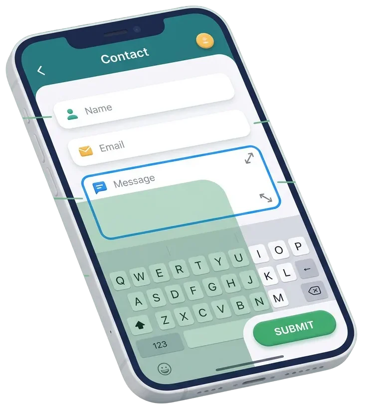
Tiny input boxes, unwanted auto-zoom, and hidden submit buttons frustrate visitors on mobile devices. When typing out an inquiry on a smartphone feels difficult, potential clients leave without reaching out. We fix form layouts, font sizes, touch targets, and mobile keyboards so visitors can complete your forms in seconds on any screen.




We set correct font sizes on all form inputs so iPhones and Android devices never trigger annoying auto-zooms while typing.
We match fields to proper input types so visitors get number pads for phone numbers and email layouts for email addresses.
We size submit buttons and checkboxes for easy finger taps without accidental clicks on surrounding links.
We resolve code conflicts where floating navigation bars or bottom banners block input fields while keyboards are open.
Most of your website visitors browse from handheld devices. When a form requires pinching, zooming, or sideways scrolling, lead conversion drops immediately. We align your form spacing, adjust input heights, and clean up responsive CSS rules. Your visitors get clean, single-column layouts that guide them smoothly from the first question to the final submit tap.




Do not guess how phone users interact with your inquiry pages. We set up simple tracking tools that monitor mobile field focus, typing completion times, and validation drop-offs right from your dashboard. You get clear data showing where mobile users get stuck so you can keep conversion rates high.

Help on-the-go buyers ask product questions without friction. We build clean mobile inquiry popups and wholesale quote forms that open fast and submit cleanly on all phones.
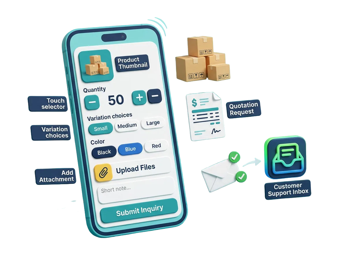
When a client theme breaks form styling on small screens, let our team fix the responsive styles. We adjust CSS media queries and touch hooks so client sites deliver high conversions.

Make a great impression on early mobile visitors. We test your waitlist forms, consultation schedulers, and contact fields on real devices before launch so every signup works smoothly.

Most social media ad clicks happen on smartphones. We remove bulky fields and optimize layout flow so visitors landing from Instagram, Facebook, and LinkedIn convert into real leads quickly.

$ 49.00
$ 99.00
$ 199.00
$ 490.00
$ 990.00
$ 1990.00
Project Step 1
“We inspect your form plugin settings, active stylesheets, field structures, and touch behavior. We test your forms on various iPhone and Android screens to see where fields overflow or zoom awkwardly.”
Project Step 2
“We plan the needed CSS media queries, font adjustments, input type corrections, and touch spacing fixes. You receive a clear summary of changes before we adjust any site code.”
Project Step 3
“We design clean mobile field rows, large tap targets, and prominent submit buttons. We ensure field labels stay readable and error messages appear clearly without pushing inputs off-screen.”
Project Step 4
“We adjust stylesheet rules, prevent iOS auto-zoom, set native keyboard tags, and resolve sticky menu overlaps. We make sure form validation fires smoothly without reloading the mobile page.”
Project Step 5
“We run end-to-end form submissions across Safari, Chrome, and social in-app browsers on a safe copy of your site. We confirm keyboards open correctly and buttons submit on the first tap.”
Project Step 6
“We apply the verified mobile updates to your live site without any downtime. We monitor real mobile visitors submitting forms to ensure a smooth experience and provide simple styling tips.”
Share your website details with us to get a complete mobile form usability audit, repair plan, and clear quote.